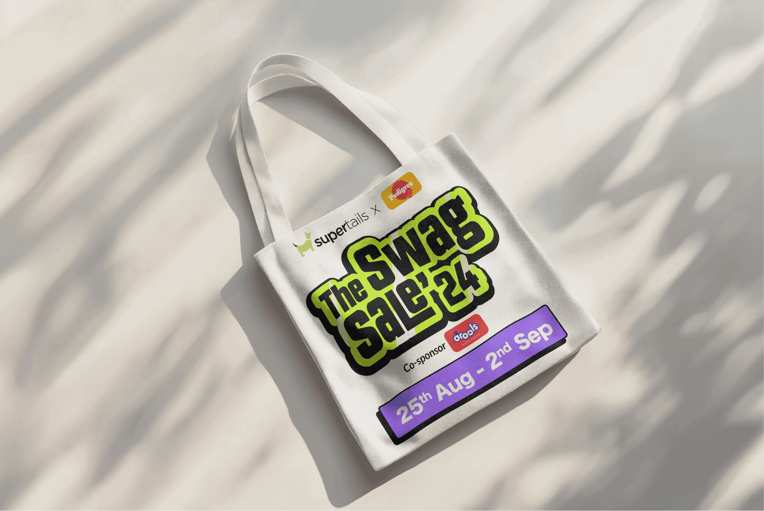
Supertails Swag Sale
A pet-care sale designed like a sneaker drop. Bounce down 23%, twelve million views.
D2C
Campaign Design
Role
Product Designer
Timeline
2 months
team
05 Backend Engineers, 2 Frontend Engineers, 1 PM, Me, 1 Junior Product Designer
platform
Web, Mweb, Mobile App

A sale is easy. A moment is not.
Supertails is the pet-care brand for India's new generation of pet parents. Vet consults, expert content, curated products, the whole ecosystem. Once a year they run the Swag Sale, and the brief made it clear this was not a discount banner exercise. It was their moment to break the feed.
The audience shops fast and scrolls faster. We weren't competing with other pet brands for their attention. We were competing with everything. Trending reels, sponsored posts, every D2C brand shouting percentages. Make it fun, make it scrollable, make it sell. That was the whole brief, and it was harder than it sounds.

Day two, when the problem changed shape
Early on we realized we weren't solving a design problem. We were solving a retention-of-attention problem. How do you make someone stop on your story? And how do you carry one energy across web, mobile, stories and static banners without repeating yourself into wallpaper?
On top of that, the constraints were real. Supertails' core colors and fonts were fixed. No full creative freedom. We had to be loud inside someone else's volume limits.
The pivot: build it like a drop
The reference that unlocked it didn't come from e-commerce at all. Sneaker drops. Music launches. Scarcity, countdowns, a single unmistakable visual world.
So we built the sale like a drop. One central visual theme, bold funky type with a layered sticker feel. A drop page with countdowns, product teases and time-locked deals instead of a standard sale landing. A modular banner system, one master design that cropped into Instagram, stories, web and email without redesigning each one. And scroll-triggered animation on the landing page so mobile felt like the energy of the campaign, not a brochure about it.

Prototyping backwards
We flipped the usual order. Instead of starting with the homepage and working outward, we started with Instagram carousels and story templates. The rule was blunt. If it didn't work on Instagram, it didn't make the cut anywhere.
From there: mobile-first layouts with floating CTAs, preview mockups of products wearing the campaign's sticker skin, and a horizontal-scroll variant we tested because the audience lives on swipe-heavy platforms anyway.

What ten pet parents told us
We interviewed ten pet parents, mostly tier one cities. I asked a question that felt almost too simple: what does a pet sale even mean to you? The answers surprised me. Almost nobody talked about the discount. They talked about whether the sale was fun. Whether there was anything worth sharing.
The analytics said the same thing from a different angle. Heatmaps from the previous sale showed people bouncing off the homepage carousels, while the playful reels and stories on Instagram held them. A social audit across pet brands here and globally turned up plenty of warm. Almost no bold.
So the insight, plainly: people weren't waiting to be sold to. They were scrolling to be surprised. Humor was outperforming discounts. Community was outperforming offers.

What happened
Bounce rate dropped 23% during the campaign. The campaign video crossed 12 million views. Instagram engagement ran at 3x the average weekly content during the sale. And the asset system shipped responsive across web, email and social from one shared master.
The result I cared about most doesn't fit in a metric. Pet parents tagged themselves. Shared photos. Made memes out of it. When your campaign becomes their content, it worked.
Looking back
We overdesigned the banners at first. The best performers turned out to be the simplest ones, which stung a little and taught me a lot. We also never pushed hard enough for TikTok-first assets, and that was a missed channel.
What worked was the modular engine. Marketing could remix assets themselves without coming back to Figma for every variant. That changed how I think about campaign design in general. The job isn't to design every asset. It's to design the thing that lets other people make assets, fast, without breaking it.

